Build a responsive image set from one photo
Admin ·
A responsive image set gives a browser several sizes of the same photo. Use the mug example to verify each width descriptor against an actual encoded file.
Make three widths from the mug photo
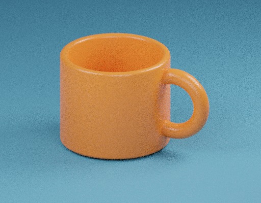
Select Load example. Keep Widths at 128, 256, 384, Output format at WebP and Quality at 75. Generate variants from the 512 × 400 image.
Each width gets a height that preserves the displayed aspect ratio, rounded to a whole pixel. Verify the following output sizes.
| Filename in the ZIP | Encoded dimensions | Width descriptor |
|---|---|---|
| image-background-mug-128w.webp | 128 × 100 | 128w |
| image-background-mug-256w.webp | 256 × 200 | 256w |
| image-background-mug-384w.webp | 384 × 300 | 384w |
ToolMellow mug example photoWHATWG HTML Standard, srcset attributes
Connect the files to your layout
Download the variants ZIP and open srcset.txt. Put the image files in the directory used by the markup, or update the candidate paths. Copy the list into the srcset attribute and set sizes to match the rendered layout.
Open variants.csv to check the actual byte count for each image. Test the smallest file where the layout is narrow and compare the details at larger sizes.
Use the displayed dimensions of a different source
Add 640 to the widths and generate again. The mug source is 512 pixels wide, so the 640 px entry is marked as skipped and omitted from the ZIP and srcset.
For a transparent source, PNG and WebP can retain transparency. Use JPEG when a white backdrop fits the design. Keep the original file for future sizes.
Common questions
Why is the height one pixel different from my calculation?
Each target height is rounded to the nearest whole source-proportional pixel, with at least one pixel in height.
Do I need the original file in the variants ZIP?
The ZIP packages the requested encoded variants, their srcset and a CSV report. Keep the original separately.